2016-10-12 27 views
1

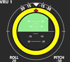
私は楕円形のプログレスバーが必要なゲージを作成しています。進捗バーのインジケータが楕円の下から上に移動するようにしたいと思います。私はそれを問題なく左から右に働かせることができます。ここで楕円形のプログレスバーの垂直インジケータ

enter image description here

スタイルのコードです:ここで

<Style TargetType="ProgressBar" x:Key="HalfCircle"> 
    <Setter Property="Template"> 
     <Setter.Value> 
      <ControlTemplate TargetType="ProgressBar"> 
       <Grid x:Name="gridRoot"> 
        <Ellipse x:Name="PART_Track" HorizontalAlignment="Left" Height="150" Stroke="Black" VerticalAlignment="Top" Width="150" Clip="M0.5,0.5 L153.5,0.5 L153.5,76.5 L0.5,76.5 z"> 
         <Ellipse.Fill> 
          <MultiBinding> 
           <MultiBinding.Converter> 
            <converter:ProgressBarIndicatorConverter/> 
           </MultiBinding.Converter> 
           <Binding Path="Foreground" RelativeSource="{RelativeSource TemplatedParent}"/> 
           <!--<Binding Path="Orientation" RelativeSource="{RelativeSource TemplatedParent}"/>--> 
           <!--<Binding Path="Background" RelativeSource="{RelativeSource TemplatedParent}"/>--> 
           <!--<Binding Path="Minimum" RelativeSource="{RelativeSource TemplatedParent}"/> 
            <Binding Path="Maximum" RelativeSource="{RelativeSource TemplatedParent}"/>--> 
           <Binding Path="IsIndeterminate" RelativeSource="{RelativeSource TemplatedParent}"/> 
           <Binding Path="ActualWidth" ElementName="PART_Indicator"/> 
           <Binding Path="ActualHeight" ElementName="PART_Indicator"/> 
           <Binding Path="ActualWidth" ElementName="PART_Track"/> 
           <!--<Binding Path="ActualHeight" ElementName="PART_Track"/>--> 
          </MultiBinding> 
         </Ellipse.Fill> 
        </Ellipse> 
        <Decorator x:Name="PART_Indicator" RenderTransformOrigin="0.5,0.5" /> 
       </Grid> 
       <!--<ControlTemplate.Triggers> 
        <Trigger Property="Orientation" Value="Vertical"> 

        </Trigger> 
       </ControlTemplate.Triggers>--> 
      </ControlTemplate> 
     </Setter.Value> 
    </Setter> 
</Style> 

は、関連するXAMLです:

<ProgressBar x:Name="pbPos" Height="158" Width="158" Margin="8,6,0,0" Orientation="Vertical" Style="{StaticResource HalfCircle}" Foreground="{StaticResource RotationLightGreen}" /> 

あなたがコメントアウトコードで見ることができるように、私はいくつかをしようとしています無駄なもの...


UPDATE < < <

私は次のようにクリップされプログレスバーとコードビハインドでいくつかの依存関係プロパティでユーザーコントロールを作成することになった:

XAMLを:

<Grid> 
    <ProgressBar x:Name="pbEllipse" Orientation="Vertical" Background="Transparent" Minimum="0" Maximum="100" Height="150" Width="150" Margin="0,0" HorizontalAlignment="Left" VerticalAlignment="Top"> 
     <ProgressBar.Clip> 
      <PathGeometry> 
       <PathFigure IsFilled="True" IsClosed="False" StartPoint="0,75"> 
        <BezierSegment Point3="75,0" Point2="33.5786476135254,0" Point1="0,33.5786399841309"/> 
        <BezierSegment Point3="150,75" Point2="150,33.5786399841309" Point1="116.421363830566,0"/> 
       </PathFigure> 
      </PathGeometry> 
     </ProgressBar.Clip> 
    </ProgressBar> 


</Grid> 

コードビハインド:

public partial class PitchProgressBar : UserControl 
{ 
    public static DependencyProperty ProgressIndicatorColorProperty = DependencyProperty.Register("ProgressIndicatorColor", typeof(Brush), typeof(PitchProgressBar), new PropertyMetadata(new PropertyChangedCallback(ProgressIndicatorColorPropertyChanged))); 
    public static DependencyProperty ProgressIndicatorValueProperty = DependencyProperty.Register("ProgressIndicatorValue", typeof(double), typeof(PitchProgressBar), new PropertyMetadata(new PropertyChangedCallback(ProgressIndicatorValuePropertyChanged))); 

    private static void ProgressIndicatorColorPropertyChanged(DependencyObject d, DependencyPropertyChangedEventArgs e) 
    { 
     var ctl = d as PitchProgressBar; 
     if (ctl != null) 
     { 
      ctl.pbEllipse.Foreground = (Brush)e.NewValue; 
     } 
    } 

    private static void ProgressIndicatorValuePropertyChanged(DependencyObject d, DependencyPropertyChangedEventArgs e) 
    { 
     var ctl = d as PitchProgressBar; 
     if (ctl != null) 
     { 
      ctl.pbEllipse.Value = (double)e.NewValue; 
     } 
    } 

    public PitchProgressBar() 
    { 
     InitializeComponent(); 

    } 

    public Brush ProgressColor 
    { 
     get { return (Brush)GetValue(ProgressIndicatorColorProperty); } 
     set { SetValue(ProgressIndicatorColorProperty, value); } 
    } 

    public double ProgressIndicatorValue 
    { 
     get { return (double)GetValue(ProgressIndicatorValueProperty); } 
     set { SetValue(ProgressIndicatorValueProperty, value); } 
    } 
} 
+1

一つのオプション...あなたは、変換のレイアウトを適用することができ全体を90度回転させるだけですか? – Joe

+0

待って、巨大なマルチバインディングはどうしていますか? – Joe

+0

回転を使用できません...半円全体が回転し、平坦な端が底になるようにします。 – Radiohead

答えて

1

は、このカスタムコントロールを試してみてください。

public class FlightGauge : Control 
{ 
    private GradientStopCollection _gradStops = new GradientStopCollection(); 

    public static DependencyProperty MinValueProperty = DependencyProperty.Register("MinValue", typeof(double), typeof(FlightGauge), new FrameworkPropertyMetadata(-100.0, new PropertyChangedCallback(MinValue_Changed))); 
    public static DependencyProperty MaxValueProperty = DependencyProperty.Register("MaxValue", typeof(double), typeof(FlightGauge), new FrameworkPropertyMetadata(100.0, new PropertyChangedCallback(MaxValue_Changed))); 
    public static DependencyProperty ValueProperty = DependencyProperty.Register("Value", typeof(double), typeof(FlightGauge), new FrameworkPropertyMetadata(0.0, new PropertyChangedCallback(Value_Changed))); 
    public static DependencyProperty FillColorProperty = DependencyProperty.Register("FillColor", typeof(Color), typeof(FlightGauge), new FrameworkPropertyMetadata(Colors.Blue, new PropertyChangedCallback(FillColor_Changed))); 

    public Color FillColor 
    { 
     get { return (Color)GetValue(FillColorProperty); } 
     set { SetValue(FillColorProperty, value); } 
    } 


    private static void FillColor_Changed(DependencyObject o, DependencyPropertyChangedEventArgs args) 
    { 
     FlightGauge thisClass = (FlightGauge)o; 
     thisClass.SetFillColor(); 
    } 

    private void SetFillColor() 
    { 
     //Put Instance FillColor Property Changed code here 
    } 

    public double Value 
    { 
     get { return (double)GetValue(ValueProperty); } 
     set { SetValue(ValueProperty, value); } 
    } 


    private static void Value_Changed(DependencyObject o, DependencyPropertyChangedEventArgs args) 
    { 
     FlightGauge thisClass = (FlightGauge)o; 
     thisClass.SetValue(); 
    } 

    private void SetValue() 
    { 
     CalcTabStops(); 
    } 


    public double MaxValue 
    { 
     get { return (double)GetValue(MaxValueProperty); } 
     set { SetValue(MaxValueProperty, value); } 
    } 


    private static void MaxValue_Changed(DependencyObject o, DependencyPropertyChangedEventArgs args) 
    { 
     FlightGauge thisClass = (FlightGauge)o; 
     thisClass.SetMaxValue(); 
    } 

    private void SetMaxValue() 
    { 
     CalcTabStops(); 
    } 

    public double MinValue 
    { 
     get { return (double)GetValue(MinValueProperty); } 
     set { SetValue(MinValueProperty, value); } 
    } 

    private static void MinValue_Changed(DependencyObject o, DependencyPropertyChangedEventArgs args) 
    { 
     FlightGauge thisClass = (FlightGauge)o; 
     thisClass.SetMinValue(); 
    } 

    private void SetMinValue() 
    { 
     CalcTabStops(); 
    } 


    private void CalcTabStops() 
    { 
     _gradStops.Clear(); 
     if (Value > 0) 
     { 
      double dLineValue = (1 - Value/MaxValue) /2; 
      if (dLineValue > 0.49) dLineValue = 0.49; 
      _gradStops.Add(new GradientStop(Colors.Transparent, 0.500)); 
      _gradStops.Add(new GradientStop(Colors.Transparent, 1.0)); 
      _gradStops.Add(new GradientStop(FillColor, 0.499)); 
      _gradStops.Add(new GradientStop(Colors.Transparent, dLineValue)); 
      _gradStops.Add(new GradientStop(FillColor, dLineValue +0.001)); 
     } 
     else 
     { 
      double dLineValue = 0.5 + (Value/MinValue/2); 
      if (dLineValue >= 1) dLineValue = 0.998; 
      if (dLineValue == 0.5) dLineValue = 0.5001; 
      _gradStops.Add(new GradientStop(Colors.Transparent, dLineValue +0.01)); 
      _gradStops.Add(new GradientStop(Colors.Transparent, 1.0)); 
      _gradStops.Add(new GradientStop(FillColor, dLineValue)); 
      _gradStops.Add(new GradientStop(Colors.Transparent, 0.5)); 
      _gradStops.Add(new GradientStop(FillColor, 0.501)); 
     } 
     this.InvalidateVisual(); 
    } 

    public FlightGauge() 
    { 
     BorderBrush = Brushes.Black; 
    } 

    protected override void OnRender(DrawingContext drawingContext) 
    { 
     Brush brush = null; 
     if (Value != 0) 
     { 
      LinearGradientBrush linBrush = new LinearGradientBrush(); 
      linBrush.StartPoint = new Point(0.5, 0); 
      linBrush.EndPoint = new Point(0.5, 1); 
      linBrush.GradientStops = _gradStops; 
      brush = linBrush; 
     } 
     else 
     { 
      brush = Brushes.Transparent; 
     } 
     double dX = this.ActualWidth/2; 
     double dY = this.ActualHeight/2; 
     Pen pen = new Pen(BorderBrush, 2); 
     drawingContext.DrawEllipse(brush, pen, new Point(dX, dY), dX, dY); 
     drawingContext.DrawLine(pen, new Point(0, dY), new Point(this.ActualWidth, dY)); 
     base.OnRender(drawingContext); 
    } 
} 

使用例:

<Window x:Class="WpfApplication1.MainWindow" 
    xmlns="http://schemas.microsoft.com/winfx/2006/xaml/presentation" 
    xmlns:x="http://schemas.microsoft.com/winfx/2006/xaml" 
    xmlns:d="http://schemas.microsoft.com/expression/blend/2008" 
    xmlns:mc="http://schemas.openxmlformats.org/markup-compatibility/2006" 
    xmlns:local="clr-namespace:WpfApplication1" 
    mc:Ignorable="d" 
    Title="MainWindow" Height="350" Width="525"> 
<Grid> 
    <Grid.RowDefinitions> 
     <RowDefinition Height="*" /> 
     <RowDefinition Height="Auto" /> 
    </Grid.RowDefinitions> 
    <local:FlightGauge x:Name="fgGauge" Width="200" Height="200" Value="{Binding ElementName=sldValue, Path=Value}" /> 
    <Slider Name="sldValue" Minimum="-100" Maximum="100" Value="0" Grid.Row="1" /> 
</Grid> 

+0

はい私はちょうどそれをしました!私はあなたのソリューションを見たときにアップデートを投稿しようとしていました。おかげでケリー。私もあなたのものに似た私のソリューションを投稿します。 – Radiohead