2017-11-14 9 views
1

私はCSSの問題に苦労しています。私はいくつかの助けを望んでいました。Css表のセルと相対的な幅

ここに物語があります:
私はヘッダーをデザインしています。それは2つの部門に分かれています。最初は70%幅で、もう1つは30%幅でなければなりません。私はcssプロパティ "Display:table-cell"を並べて並べて配置しました。

div.chapo { 
width: 70%; 
display: table-cell; 
} 

div.img_header { 
width: 30%; 
display: table-cell; 
background-position: center center; 
background-repeat: no-repeat; 
background-size: cover; 
-webkit-background-size: cover; 
background-image: url(...); 
} 

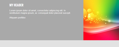
最初のdivに配置されたテキストが十分に長い場合それは正常に動作しています:

ok

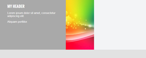
Buuuut ...テキストが短い場合、それはすべての厄介だ:

notok

この特定のケースでは、私の幅の値が保持されない理由を理解できません。親切にも私を助けることであろうすべての人のために事前に
おかげで...

ここでフィドルのリンクです:https://jsfiddle.net/vinny38/verucw8p/3/

答えて

1

は私が.test-wrapクラスに両方のdiv ce_text chapoimg_headerを包み、CSSの下にそれを与える:

.test-wrap { 
display: table; 
width: 100%; 
} 

body, 
 
div { 
 
    margin: 0; 
 
    padding: 0; 
 
    font-family: 'Roboto condensed', sans-serif; 
 
} 


div.inside { 
 
    position: relative; 
 
} 


div.chapo { 
 
    background-color: #ef4056; 
 
    background-image: none; 
 
    width: 70%; 
 
    height: 255px; 
 
    display: table-cell; 
 
    vertical-align: top; 
 
    background-color: #aaa; 
 
    color: #fff; 
 
    padding: 20px 8%; 
 
    position: relative; 
 
} 


h1 { 
 
    margin-top: 0; 
 
    font: 1.4em 'Oswald', Helvetica, sans-serif; 
 
    font-weight: bold; 
 
    text-transform: uppercase; 
 
} 


div.chapo p { 
 
    width: 100%; 
 
    min-width: 100%; 
 
    position: relative; 
 
    padding: 0; 
 
    font-size: 1em; 
 
    font-weight: 300; 
 
} 


div.img_header { 
 
    width: 30%; 
 
    position: relative; 
 
    display: table-cell; 
 
    vertical-align: top; 
 
    background-position: center center; 
 
    background-repeat: no-repeat; 
 
    background-size: cover; 
 
    -webkit-background-size: cover; 
 
    background-image: url(https://image.freepik.com/free-psd/abstract-background-design_1297-73.jpg); 
 
} 


div.mod_breadcrumb { 
 
    height: 40px; 
 
    margin: 0; 
 
    padding-top: 5px; 
 
    padding-right: 30px; 
 
    padding-bottom: 5px; 
 
    background-color: #e3e3e3; 
 
    padding-left: 8%; 
 
} 


.mod_breadcrumb ul li { 
 
    height: 30px; 
 
    display: inline-block; 
 
    padding: 3px 0; 
 
    color: #828282; 
 
} 
 
.test-wrap { 
 
    display: table; 
 
    width: 100%; 
 
}
<div class="inside"> 
 
    <div class="test-wrap"> 
 
    <div class="ce_text chapo"> 
 
     <h1>My header</h1> 
 
     <div class='text-chapo'> 
 
     <p>Lorem ipsum dolor sit Lorem ipsum dolor sit amet, consectetur adipiscing </p> 
 
     </div> 
 
    </div> 
 
    <div class="img_header"></div> 
 
    </div> 
 
    <div class="mod_breadcrumb block"> 
 
    <ul> 
 
     <li></li> 
 
     <li></li> 
 
     <li></li> 
 
    </ul> 
 
    </div> 
 
</div>

+0

完璧!ありがとう^^ – Vinny

+0

大歓迎.... –

0

はこのCSS、それは大丈夫だ...「フロート:左」オプションと相対的な幅です異なる。 ここでは、全幅の左と右のパディングを分けます。フロートは水平に整列する必要があります。

body, 
div { 
    margin: 0; 
    padding: 0; 
    font-family: 'Roboto condensed', sans-serif; 

} 

div.inside { 
    position: relative; 
} 

div.chapo { 
     background-image: none; 
    width: 50%; 
    height: 255px; 
    vertical-align: top; 
    background-color: #aaa; 
    color: #fff; 
    padding: 20px 10%; 
    position: relative; 
    float: left; 

} 

h1 { 
    margin-top: 0; 
    font: 1.4em 'Oswald', Helvetica, sans-serif; 
    font-weight: bold; 
    text-transform: uppercase; 
} 

div.chapo p { 
    width: 100%; 
    position: relative; 
    padding: 0; 
    font-size: 1em; 
    font-weight: 300; 
} 

div.img_header { 
    width: 30%; 
    position: relative; 
    height: 295px; 
    vertical-align: top; 
    background-position: center center; 
    background-repeat: no-repeat; 
    background-size: cover; 
    float: left; 
    -webkit-background-size: cover; 
    background-image: url(https://image.freepik.com/free-psd/abstract-background-design_1297-73.jpg); 
} 

div.mod_breadcrumb { 
    height: 40px; 
    margin: 0; 
    padding-top: 5px; 
    padding-right: 2%; 
    padding-bottom: 5px; 
    background-color: #e3e3e3; 
    padding-left: 8%; 
    float:left; 
    width:90%; 
} 

.mod_breadcrumb ul li { 
    height: 30px; 
    display: inline-block; 
    padding: 3px 0; 
    color: #828282; 

} 
0

は次のように試してみてください: あなたはfloatを定義する必要がありますプロパティと同様に定義する必要がありますあなたのimg_headerクラスの(他のdivの場合は255pxの高さを指定しています)。本当に必要です。

body, 
 
div { 
 
    margin: 0; 
 
    padding: 0; 
 
    font-family: 'Roboto condensed', sans-serif; 
 
    box-sizing: border-box 
 
} 


div.inside { 
 
    position: relative; 
 
} 


div.chapo { 
 
    background-color: #ef4056; 
 
    background-image: none; 
 
    width: 70%; 
 
    float:left; 
 
    height: 255px; 
 
    display: table-cell; 
 
    vertical-align: top; 
 
    background-color: #aaa; 
 
    color: #fff; 
 
    padding: 20px 8%; 
 
    position: relative; 
 
} 


h1 { 
 
    margin-top: 0; 
 
    font: 1.4em 'Oswald', Helvetica, sans-serif; 
 
    font-weight: bold; 
 
    text-transform: uppercase; 
 
} 


div.chapo p { 
 
    width: 100%; 
 
    min-width: 100%; 
 
    position: relative; 
 
    padding: 0; 
 
    font-size: 1em; 
 
    font-weight: 300; 
 
} 
 
.clearfix { 
 
    clear:both; 
 
} 
 
.img_header { 
 
    width: 30%; 
 
height: 255px; 
 
    float: right; 
 
    position: relative; 
 
    display: table-cell; 
 
    vertical-align: top; 
 
    background-position: center center; 
 
    background-repeat: no-repeat; 
 
    background-size: cover; 
 
    -webkit-background-size: cover; 
 
    background-image: url(https://image.freepik.com/free-psd/abstract-background-design_1297-73.jpg); 
 
} 


div.mod_breadcrumb { 
 
    height: 40px; 
 
    margin: 0; 
 
    padding-top: 5px; 
 
    padding-right: 30px; 
 
    padding-bottom: 5px; 
 
    background-color: #e3e3e3; 
 
    padding-left: 8%; 
 
} 


.mod_breadcrumb ul li { 
 
    height: 30px; 
 
    display: inline-block; 
 
    padding: 3px 0; 
 
    color: #828282; 
 
}
<div class="inside"> 
 
    <div class="ce_text chapo"> 


    <div class='text-chapo'> 
 
    <h1>My header</h1> 
 
     <p>Lorem </p> 
 
     <p>Aliquam porttitor.</p> 
 
    </div> 
 
    </div> 


    <div class="img_header"></div> 


    <div class="mod_breadcrumb block"> 
 
    <ul> 
 
     <li></li> 
 
     <li></li> 
 
     <li></li> 
 
    </ul> 
 
    </div> 
 
</div> 
 
<div class="clearfix"></div>

関連する問題