2016-07-22 13 views
-1

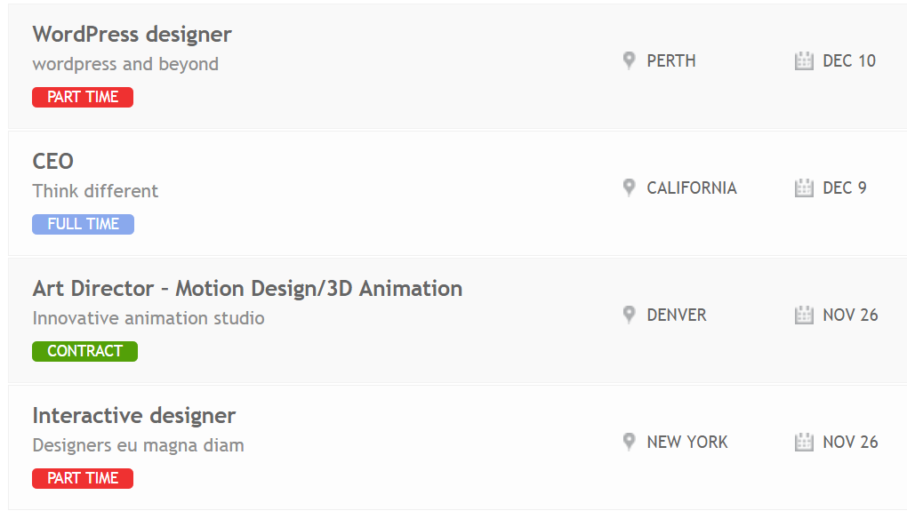
私は3行のリストを持っています。各行には3つの列があります。最初の列には、ジョブ名、ジョブの説明、およびジョブの種類の3行を含むジョブの詳細が表示され、2行目には位置が示され、最後の行には期日が表示されます。私の期待する結果は次の通りです。CSSの行の中央にテキストを配置するにはどうすればよいですか?

enter image description here 私はw3.cssを使っています。

<link rel="stylesheet" href="http://www.w3schools.com/lib/w3.css"> 

私は3つの列を連続して作成しました。

<div class="w3-row-padding"> 
    <div class="w3-third" style="width:50%"> 
     <h2>Wordpress desiger</h2> 
     <p class="desc">Wordpress and beyond </p> 
     <span class="jobtype">Part time</span> 
    </div> 
    <div class="w3-third" style="width:30%"> 
     <p class="location">NY.</p> 
    </div> 
    <div class="w3-third" style="width:20%"> 
     <p class="time">Jan.</p> 
    </div> 
</div> 

私の問題は、私は、行の中央にテキストの位置、及び時間を揃えることができないということである次のように行ごとに、私は詳細を挿入します。それを修正する手助けをしてもらえますか?期待どおりの結果を達成するにはどうすればいいですか(場所と時間の後ろにアイコンを追加する)?

これは、中央にテキストを配置するtext-align: center;を使用して、私のCSSコード

body{ 
 
    \t font-family: 'Arial', sans-serif; 
 
    \t font-size: 12px; 
 
    \t overflow-x: hidden; 
 
    } 


    a { text-decoration: none; } 


    /** content display **/ 
 
    #view { display: block; padding: 0; margin: 0; height:600px; overflow:hidden; overflow-y:scroll;} 
 
    #container { display: block; margin-top: 0px; } 
 
    #container ul a li { 
 
    \t display: block; 
 
    \t width: 100%; 
 
    \t border-bottom: 1px solid #b9b9b9; 
 
    \t border-top: 1px solid #f7f7f7; 
 
    \t background: #FFF; 


    } 
 
    span.jobtype{ 
 
     background-color: red; 
 
     border-radius: 5px; 
 
     border: 5px solid red; 
 
     color: #FFFFFF; 
 
    }
<!DOCTYPE html> 
 
<html> 
 
<head> 
 
<title>HTML5, CSS3 and JavaScript demo</title> 
 
</head> 
 
<meta name="viewport" content="width=device-width, initial-scale=1"> 
 
<link rel="stylesheet" href="http://www.w3schools.com/lib/w3.css"> 
 
<body> 
 
\t <div id="view"> \t 
 
\t \t <div id="container"> 
 
\t \t \t <ul> 
 
\t \t \t \t <!-- row 01 --> 
 
\t \t \t \t <a href="#"><li class="clearfix"> 
 
\t \t \t \t \t <div class="w3-row-padding"> 
 
\t \t \t \t \t \t <div class="w3-third" style="width:50%"> 
 
\t \t \t \t \t \t \t <h2>Wordpress desiger</h2> 
 
\t \t \t \t \t \t \t <p class="desc">Wordpress and beyond </p> 
 
\t \t \t \t \t \t \t <span class="jobtype">Part time</span> 
 
\t \t \t \t \t \t </div> 
 
\t \t \t \t \t \t <div class="w3-third" style="width:30%"> 
 
\t \t \t \t \t \t \t <p class="location">NY.</p> 
 
\t \t \t \t \t \t </div> 
 
\t \t \t \t \t \t <div class="w3-third" style="width:20%"> 
 
\t \t \t \t \t \t \t <p class="time">Jan.</p> 
 
\t \t \t \t \t \t </div> 
 
\t \t \t \t \t </div> 
 
\t \t \t \t </li></a> 


\t \t \t \t <!-- row 02 --> 
 
\t \t \t \t <a href="#"><li class="clearfix"> 
 
\t \t \t \t \t <div class="w3-row-padding"> 
 
\t \t \t \t \t \t <div class="w3-third" style="width:50%"> 
 
\t \t \t \t \t \t \t <h2>CEO</h2> 
 
\t \t \t \t \t \t \t <p class="desc">Think different</p> 
 
\t \t \t \t \t \t \t <span class="jobtype">Contract</span> 
 
\t \t \t \t \t \t </div> 
 
\t \t \t \t \t \t <div class="w3-third" style="width:30%">        
 
\t \t \t \t \t \t \t <p class="location">Denver</p> 
 
\t \t \t \t \t \t </div> 
 
\t \t \t \t \t \t <div class="w3-third" style="width:20%"> 
 
\t \t \t \t \t \t \t <p class="time">Feb.</p> \t \t \t \t 
 
\t \t \t \t \t \t </div> 
 
        </div> 
 
\t \t \t \t </li></a> 
 
\t \t \t </ul> 
 
\t \t </div> 
 
\t </div> 
 
</body> 
 
</html>

+0

申し訳ありませんが、私はCtrlキー+ Fを押すと、 "テキスト整列" を検索し、それが見つかりませんでしたか?すべてのコードを提供していますか? –

+0

違うので、削除するだけです。私はstyle = "text-align:center;"を追加しました。 – user3051460

+0

2番目の列は行ではなく、最後の列は最終行ではない日付用です。 –

答えて

1

使用flexbox:垂直整列あなたのdivに使用display:flex.w3-row-padding

.w3-row-padding { 
    display:flex; 
    align-items:center; 
    } 

body{ 
 
    \t font-family: 'Arial', sans-serif; 
 
    \t font-size: 12px; 
 
    \t overflow-x: hidden; 
 
    } 


    a { text-decoration: none; } 


    /** content display **/ 
 
    #view { display: block; padding: 0; margin: 0; height:600px; overflow:hidden; overflow-y:scroll;} 
 
    #container { display: block; margin-top: 0px; } 
 
    #container ul a li { 
 
    \t display: block; 
 
    \t width: 100%; 
 
    \t border-bottom: 1px solid #b9b9b9; 
 
    \t border-top: 1px solid #f7f7f7; 
 
    \t background: #FFF; 


    } 
 
    span.jobtype{ 
 
     background-color: red; 
 
     border-radius: 5px; 
 
     border: 5px solid red; 
 
     color: #FFFFFF; 
 
    } 
 
.w3-row-padding { 
 
    display:flex; 
 
    align-items:center; 
 
    }
<!DOCTYPE html> 
 
<html> 
 
<head> 
 
<title>HTML5, CSS3 and JavaScript demo</title> 
 
</head> 
 
<meta name="viewport" content="width=device-width, initial-scale=1"> 
 
<link rel="stylesheet" href="http://www.w3schools.com/lib/w3.css"> 
 
<body> 
 
\t <div id="view"> \t 
 
\t \t <div id="container"> 
 
\t \t \t <ul> 
 
\t \t \t \t <!-- row 01 --> 
 
\t \t \t \t <a href="#"><li class="clearfix"> 
 
\t \t \t \t \t <div class="w3-row-padding"> 
 
\t \t \t \t \t \t <div class="w3-third" style="width:50%"> 
 
\t \t \t \t \t \t \t <h2>Wordpress desiger</h2> 
 
\t \t \t \t \t \t \t <p class="desc">Wordpress and beyond </p> 
 
\t \t \t \t \t \t \t <span class="jobtype">Part time</span> 
 
\t \t \t \t \t \t </div> 
 
\t \t \t \t \t \t <div class="w3-third" style="width:30%"> 
 
\t \t \t \t \t \t \t <p class="location">NY.</p> 
 
\t \t \t \t \t \t </div> 
 
\t \t \t \t \t \t <div class="w3-third" style="width:20%"> 
 
\t \t \t \t \t \t \t <p class="time">Jan.</p> 
 
\t \t \t \t \t \t </div> 
 
\t \t \t \t \t </div> 
 
\t \t \t \t </li></a> 


\t \t \t \t <!-- row 02 --> 
 
\t \t \t \t <a href="#"><li class="clearfix"> 
 
\t \t \t \t \t <div class="w3-row-padding"> 
 
\t \t \t \t \t \t <div class="w3-third" style="width:50%"> 
 
\t \t \t \t \t \t \t <h2>CEO</h2> 
 
\t \t \t \t \t \t \t <p class="desc">Think different</p> 
 
\t \t \t \t \t \t \t <span class="jobtype">Contract</span> 
 
\t \t \t \t \t \t </div> 
 
\t \t \t \t \t \t <div class="w3-third" style="width:30%">        
 
\t \t \t \t \t \t \t <p class="location">Denver</p> 
 
\t \t \t \t \t \t </div> 
 
\t \t \t \t \t \t <div class="w3-third" style="width:20%"> 
 
\t \t \t \t \t \t \t <p class="time">Feb.</p> \t \t \t \t 
 
\t \t \t \t \t \t </div> 
 
\t \t \t \t </li></a> 
 
\t \t \t </ul> 
 
\t \t </div> 
 
\t </div> 
 
</body> 
 
</html>

+0

パーフェクト。わかった。上記のようにテキストの後ろにアイコン(位置/時間)を挿入することは可能ですか? – user3051460

+0

はい、fontawesomeを次のようなアイコンに使用できます。例:[http://fontawesome.io/icon/map-marker](http: //fontawesome.io/icon/map-marker/) – Rohit

+1

あなたは 'w3.css'を使っているので、これを読んでください[http://www.w3schools.com/w3css/w3css_icons.asp](http://www.w3schools.com/w3css_icons.asp] w3schools.com/w3css/w3css_icons.asp) – Rohit

-1

です。

0

/編集クラスを追加します。

.w3-row-padding { 
    align-items: center; 
    display: flex; 
} 

body{ 
 
    \t font-family: 'Arial', sans-serif; 
 
    \t font-size: 12px; 
 
    \t overflow-x: hidden; 
 
    } 


    a { text-decoration: none; } 


    /** content display **/ 
 
    #view { display: block; padding: 0; margin: 0; height:600px; overflow:hidden; overflow-y:scroll;} 
 
    #container { display: block; margin-top: 0px; } 
 
    #container ul a li { 
 
    \t display: block; 
 
    \t width: 100%; 
 
    \t border-bottom: 1px solid #b9b9b9; 
 
    \t border-top: 1px solid #f7f7f7; 
 
    \t background: #FFF; 


    } 
 
    span.jobtype{ 
 
     background-color: red; 
 
     border-radius: 5px; 
 
     border: 5px solid red; 
 
     color: #FFFFFF; 
 
    }
<!DOCTYPE html> 
 
<html> 
 
<head> 
 
<title>HTML5, CSS3 and JavaScript demo</title> 
 
</head> 
 
<meta name="viewport" content="width=device-width, initial-scale=1"> 
 
<link rel="stylesheet" href="http://www.w3schools.com/lib/w3.css"> 
 
<body> 
 
\t <div id="view"> \t 
 
\t \t <div id="container"> 
 
\t \t \t <ul> 
 
\t \t \t \t <!-- row 01 --> 
 
\t \t \t \t <a href="#"><li class="clearfix"> 
 
\t \t \t \t \t <div class="w3-row-padding"> 
 
\t \t \t \t \t \t <div class="w3-third" style="width:50%"> 
 
\t \t \t \t \t \t \t <h2>Wordpress desiger</h2> 
 
\t \t \t \t \t \t \t <p class="desc">Wordpress and beyond </p> 
 
\t \t \t \t \t \t \t <span class="jobtype">Part time</span> 
 
\t \t \t \t \t \t </div> 
 
\t \t \t \t \t \t <div class="w3-third" style="width:30%"> 
 
\t \t \t \t \t \t \t <p class="location">NY.</p> 
 
\t \t \t \t \t \t </div> 
 
\t \t \t \t \t \t <div class="w3-third" style="width:20%"> 
 
\t \t \t \t \t \t \t <p class="time">Jan.</p> 
 
\t \t \t \t \t \t </div> 
 
\t \t \t \t \t </div> 
 
\t \t \t \t </li></a> 


\t \t \t \t <!-- row 02 --> 
 
\t \t \t \t <a href="#"><li class="clearfix"> 
 
\t \t \t \t \t <div class="w3-row-padding"> 
 
\t \t \t \t \t \t <div class="w3-third" style="width:50%"> 
 
\t \t \t \t \t \t \t <h2>CEO</h2> 
 
\t \t \t \t \t \t \t <p class="desc">Think different</p> 
 
\t \t \t \t \t \t \t <span class="jobtype">Contract</span> 
 
\t \t \t \t \t \t </div> 
 
\t \t \t \t \t \t <div class="w3-third" style="width:30%">        
 
\t \t \t \t \t \t \t <p class="location">Denver</p> 
 
\t \t \t \t \t \t </div> 
 
\t \t \t \t \t \t <div class="w3-third" style="width:20%"> 
 
\t \t \t \t \t \t \t <p class="time">Feb.</p> \t \t \t \t 
 
\t \t \t \t \t \t </div> 
 
\t \t \t \t </li></a> 
 
\t \t \t </ul> 
 
\t \t </div> 
 
\t </div> 
 
</body> 
 
</html>

関連する問題